Home ::: 'this place' #3
'this place' #3
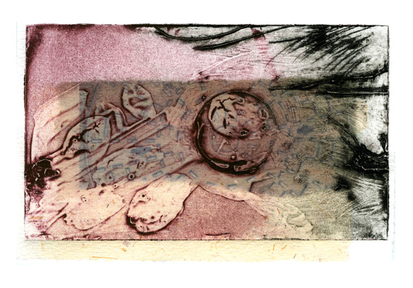
'this place' #3
archival inkjet
33 x 48 cm. (13" x 19")
Related works: 'this place' #1 and 'this place' #2
Marja-Leena | 17/02/2011 | 8 comments
themes: Digital printmaking, Printworks
'this place' #3
archival inkjet
33 x 48 cm. (13" x 19")
Related works: 'this place' #1 and 'this place' #2
Marja-Leena | 17/02/2011 | 8 comments
themes: Digital printmaking, Printworks
That is so neat and cool. And what so neat about it, is I see faces, sorta alienish look to them.
The difference is subtle but very sweet. I love how the blue gives depth and form to the piece.
I have been enjoying the differences - a fine and subtle exercise.
The differences, though subtle, are significant. I am partial to #3. Beautiful prints.
Hi Marja-leena,
Thanks so much for "visiting" me yesterday.
When did your daughter end up moving? Does she prefer living outside the city? Will you come visit again this summer?
I am curious about the prints in this series. Are they based on actual objects, which you render into more abstract forms?
Cathy, glad you like this. Isn't it interesting that many of us seem to see faces in abstract images - is that a common human trait, I wonder?
Susan, Joe and Anne, yes, I enjoy doing variations on a theme sometimes and these lent themselves to that. I might do more...
Bee, my daughter and family moved last fall into a 350+ year old house in a village in West Sussex. The rent is a lot lower than in London. They like it there as they now have a larger home and garden and it's close to organic farms and a large home-schooling community. You may wish to check out her blog: homemade stories and this post about their cottage. And yes, we'll probably visit sometime this year, it's almost two years since the last one though they were here last summer.
Oh, and about the prints. A while back I made a small collagraph as a materials and handling test for something else I was working on at the time. Later I did some more playing around with it, adding other print elements, then scanned them in and did some more work digitally before printing.
As I said, the name isn't up to much and why you and those south of the border feel it necessary to use that tic-tac-toe symbol (as if you've run out of words) for number I'll never know. Fortunately you're much better at the graphics.
Yes, this is a fine abstract and there's a deceptive element to the background; at first glance it appears like gloss house paint that has been allowed to ooze and then dry but other elements in the same plane suggest that if this is the case other techniques have also been employed. However I'm not sure I should be trying to decode the origins of the various shapes although with abstracts one can, I suppose, approach the work from a variety of angles.
One interesting thing is I remember this print as predominantly a delicate set of lines. Now I look at it again There is quite a range of line thicknesses but these don't detract from that initial impression of delicacy. You could say the print has two separate existences (in my case, any way) the real and the remembered which may well have been your aim.
Where you move completely out of my range of competence is in putting one colour with another to the advantage of both. I would never in a thousand years have set translucent pink against that diluted gunmetal but that just shows; there is a complementarity (to coin a word) that is all the more effective by the fact that the boundary between the two is almost impossible to discern. One colour magically becomes the other, and back again.
But the master stroke for me is the shaded area. Long straight lines (or an edge in this case) are supposed to be anathema to most forms of art unless they are of the essence of the work (as in Cubism and Rothko). Yet here you are breaking the rules - successfully. Because the shaded area is even more translucent than the pink and the gunmetal that straight edge traverses the irregularities beneath without jarring and providing a further bridge between the pink and the gunmetal.
I could go on but won't. I felt this print deserved something more than saying I liked it, felt it deserved a tiny bit of the effort you expended in creating it. there you go
BB, thank you for the effort you put into a long and discerning comment! Now if I can only respond in kind.
First, about using the # symbol, I'm not fond of it either. I used to use Roman numerals in pre-blogging days but those don't translate very well here, to my eye. An unfortunate compromise. Sorry it bothers you!
You make many interesting observations about the image. As I make the work, I don't consciously think about all the details you mention, it's more about what visually appeals to me and what feels right as I play around with the elements. Of course, a lifetime of studying and making art has made that process a bit easier though at times it can still be quite a struggle as I push myself to try new things. Often a lot of technical problems can frustrate, as I've sometimes written about here before. These small pieces were a delight to create.