Art in Canada & CBC

Surprise! Google News Canada had linked for a short while, two articles about Art in Canada.

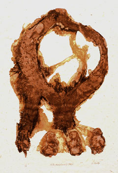
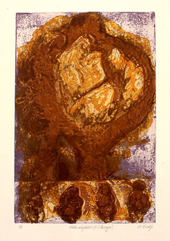
Art Matters, by Matthew Teitelbaum, director and CEO of The Art Gallery of Ontario, in the Toronto Star makes several interesting and valid points particularly about art education and the role of galleries: Artists create, not to communicate with themselves, but to communicate with others and, even then, the artist is not fully in control of all the meanings. Good art has multiple meanings and a great depth of meaning. The viewer discovers something new with each encounter. The art gallery must encourage this experience.

According to the Canada Council for the Arts, the visual arts is a billion-dollar business that affects the lives of 7.5 million Canadians. Yet the platforms of our federal political candidates are largely silent on arts and culture.

(For my non-Canadian readers – we have a national election campaign underway.)

Mirrors of the soul by MICHAEL VALPY in the Globe & Mail explores the spiritual resonance of paintings by Turner, Whistler and Monet currently showing in the Art Gallery of Ontario.

UPDATE: I almost forgot, there is an important support a stronger CBC campaign going on. Read all about it on chandrasutra’s blog.*. If you are a Canadian concerned about our culture, please sign up!

*expired link removed

Meta-morphosis IV

MMIVPrimo72.jpg
Meta-morphosis IV (Primo)
Etching & Drypoint 76 x 56 cm.

MMIVSecondo72.jpg
Meta-morphosis IV (Secondo)
Etching 76 x 56 cm.

MMIVterzo72.jpg
Meta-morphosis IV (Terzo)
Etching 76 x 56 cm.

MMIVPassages72.jpg
Meta-morphosis IV (Passages)
Etching & Drypoint 76 x 56 cm.

For Dad

This is a wonderful poem written by my eldest daughter and designed by my youngest for their father on this Father’s Day.
Click on image to view larger.
king-small.jpg
Poem © Anita Rathje
Design © Erika Rathje

displaying work online

It is sometimes a frustrating and disappointing exercise to display my artworks online because the original does not reproduce well. My prints have a lot of texture and subtle details that are often lost. The sense of the size of the piece is lacking. Colours in particular are difficult to reproduce accurately and change from monitor to monitor. In catalogues, too, I see problems with accurate colour reproduction. I do notice though that if my work is a digital print, then that reproduces reasonably well if I use the original digital file. But, if the image comes from a slide taken of the work then scanned, I often have problems. So, the more steps away from the original, then more the problems.

Today’s electric skin has an article about this issue: Challenges of Digital Reproduction by Olga Chemokhud Doty.

In the present day environments of virtual galleries, digital imaging, and communication via e-mail a whole new set of challenges arise for the artists working in traditional two-dimensional mediums of painting or drawing. “Even the most perfect reproduction of a work of art is lacking in one element: its presence in time and space, its unique existence at the place where it happens to be,” Walter Benjamin wrote in his essay, “The work of Art in the Age of Mechanical Reproduction”. Though the statement was written more then seventy years ago, the rise in volume in visual communications is making its more of an issue then ever.

Read more…, then she finishes: I am sure that there are no means to reproduce an original without losing some of its indented qualities, but there are some ways to think about the best possible way to reference the work without warping its meaning. (I wonder what those ways might be besides using installation shots?)

The author talks about digital reproduction, but even older methods of reproduction in books, catalogues and even slides can be misleading. Yet we know they were often the only way we got to see a lot of art works. I recall the many hours spent in Art History classes looking at slides. Years later I would see some of these masterpieces in European museums and be quite amazed and enthralled at the difference. The internet has opened the world even more, but in all of this, seeing the original is still the only true experience of the work.

Edward Burtynsky

Toronto photographer Edward Burtynsky, who has made a specialty of capturing the terrible beauty of destruction, was declared the fourth and last winner of the Roloff Beny award at a reception last night at the Royal Ontario Museum. His book, an exhibition catalogue titled Before The Flood, was chosen the best photography book published last year… Burtynsky took home $50,000… [The book contains] the striking images Burtynsky took of the Three Gorges Dam in China, the world’s largest hydroelectric engineering feat, as it was being built. Read more in the Toronto Star.

Edward Burtynsky has an excellent website showing his works and impressive exhibition history. I really like his artist statement:

Exploring the Residual Landscape

Nature transformed through industry is a predominate theme in my work. I set course to intersect with a contemporary view of the great ages of man; from stone, to minerals, oil, transportation, silicon, and so on. To make these ideas visible I search for subjects that are rich in detail and scale yet open in their meaning. Recycling yards, mine tailings, quarries and refineries are all places that are outside of our normal experience, yet we partake of their output on a daily basis.

These images are meant as metaphors to the dilemma of our modern existence; they search for a dialogue between attraction and repulsion, seduction and fear. We are drawn by desire – a chance at good living, yet we are consciously or unconsciously aware that the world is suffering for our success. Our dependence on nature to provide the materials for our consumption and our concern for the health of our planet sets us into an uneasy contradiction. For me, these images function as reflecting pools of our times.

Kiki Smith & Giuseppe Penone

Doing my daily blogstroll, I stopped at Modern Art Notes where Tyler Green writes that unlike in the past, “this month’s ArtForum is pretty much a must-read”.

There, my eye was caught by Kiki Smith’s name and because I’d written about her printmaking work a while ago, I was intrigued to find a review of her show at MOMA by Carol Armstrong.

Armstrong also writes in the same article about Giuseppe Penone’s huge drawings at the Drawing Center. It’s a rather unusual and interestingly subjective account of her reactions to each artist’s works.

Giuseppe Penone is an Italian sculptor new to me; if you want to learn more about him, check out the Drawing Center’s press release, his catalogues and short reviews with an image here and here.

the Sami and Siida

Part of my ongoing research into my Finnish ethnology has been learning more about the other groups in the Finno-Ugrian family of people. The Sami (formerly called Lapps) of Northern Finland, Sweden, Norway and Northwest Russia are one group and they have a wonderful centre, Siida***, located in Inari in Finnish Lapland.

Siida is the home of the Sami Museum and Northern Lapland Nature Centre, both a meeting place and an exhibition centre devoted to the Sami culture and the nature of the far north. It includes an open-air museum begun in 1960 and restored in 2000. There are many interesting pages to explore and learn, for example, that this is the oldest area in Northern Lapland inhabited by people and that some archaeological findings from the area are from 9,000 years ago. People have lived there as early as the prehistoric times, the Stone Age and the Early Metal Age, about 6,000 -2,000 years ago.

Like many indigenous people around the world, the Sami have been actively reviving their ancient culture and this centre offers many events celebrating it and others, for themselves and for visitors. One of this summer’s visiting exhibitions is from Hokkaido: The Ainu and the World of Gods. (I happened to write about the Ainu a while ago.)

The Calendar Archive lists the rich variety of past events. Skolt Sami includes a digital slide show with narration about the wartime evacuation and settlement of this group of displaced peoples. The annual Skabmagovat Reflections of the Endless Night Festival in January 2004 is interesting – click on “Northern Lights Theatre” (left sidebar) which is made entirely of snow and lit with real candles. The coldest shows have taken place at -40C! Then click on “Animation” and see the Aurora.

More about the Sami.

***March 21st, 2012: These links have been updated. Some of the mentioned pages are no longer at their specified locations after nine years, I’m sorry to say, but do search around the site if interested.

alphabet books

Abecedarium* is an online exhibit of lovely hand-made alphabet books by the Guild of Book Workers.

Given only the ‘alphabet’ theme, each participant has created a unique interpretation of the letterform, delivering two- and three-dimensional works in a plethora of materials, from acrylic to cloth, paper to leather, buttons to mylar and other unusual materials. Representing the many facets of the world known as ‘the book arts’, this exhibit includes calligraphy, typography, bookbinding and papermaking in both unique and traditional forms.

Note some of the additional links such as 26 Words by Peter D. Verheyen & Thorsten Dennerline who lithographically printed their illustrations from hand-drawn plates. Their site includes descriptions of several printmaking processes.

(Thanks to plep.)

Actually, when I first read the caption “alphabet books”, I expected to see something like this very first reader (in Finnish) from my childhood:

aapinen.jpg

*Sadly, this site no longer exists and link has been removed.

Statement: Meta-morphosis series

The Meta-morphosis series (1994 – 1998) was made using the etching process as one that can imitate weathering and aging processes. The prefix “meta”, a chemistry term, refers to the use of acids and salts, or the organic derivative of an acid; “morphosis” is a change, transformation or degeneration. Printmaking allows for stages in the series to become visible, as each plate was printed at certain stages in its degeneration.

Both Meta-morphosis I and II reveal on the one print the several stages of the image as it metamorphoses. In Meta-morphosis III to XII, each stage stands alone. These stages are subtitled the primo, or first state, which was followed by a progression of deep etches, printed to produce the secondo (second) state, and deeply etched again to form the terzo (third) state. A fourth set of variations is subtitled Passages, in which each of the three states of a plate were printed as layers over each other on the same sheet of paper.

The Meta-morphosis prints reveal a multiple life in which every stage in their degeneration is important. They are images of forms becoming aged to disintegration, the origins of the images becoming uncertain, their disparate forms merging but not absorbed. As prints they exist as stills from a moving process. As a series they draw attention to the continual morphing and weathering of form.

Meta-morphosis III

MMIIIprimo.jpg
Meta-morphosis III (Primo)
Etching 75 x 56 cm.

MMIIISecondo.jpg
Meta-morphosis III (Secondo)
Etching 75 x 56 cm.

MMIIITerzo.jpg
Meta-morphosis III (Terzo)
Etching 75 x 56 cm.

MMIIIPassages.jpg
Meta-morphosis III (Passages)
Etching 75 x 56 cm.