A.R. Menne’s art

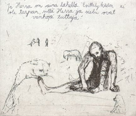
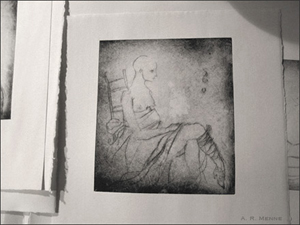
VVOI at New Art introduces new-to-me artist A.R. Menne**. I was immediately struck by the compelling images that are beautifully drawn, sometimes etched, sometimes with watercolour and the compelling writing, with some excellent quotes by others.

Menne_z_print2.jpg

From entry 03-27**: (From journals:) Last night was my first of a series of etching classes, and at one point, while she, slender as bones from a lifetime of filing and polishing and rubbing and blotting and pulling, demonstrated the proper way to scrape the edge of a copper plate (at 45 degree angles) with a metal file, she admonished us against turning our heads and averting our eyes from the burring copper: and she unveiled for us three aquamarine green dents in the square knuckle of her thumb, three marks side by side, copper filaments embedded in the flesh and oxidized the color of cheese mold, like a faded tattoo….

And you must read Entry 04-03**, about extracts from the 1999 diary of Czech film-maker Jan Svankmajer. I love the quote selected here.

But who is this artist – the site has no personal information? Googling revealed this item in April/May 2004 issue of Plum Ruby Review:

Menne is a 24 year-old artist living in Seattle “with a wee circus of rodents and a musician.” Her graphite drawings seem to echo this description; they are whimsical, disturbing and yet they have a sweet lyrical quality to them. Each drawing seems to manifest a bit of that same, nearly disturbing, fantastical quality–H.R. Giger meets Cirque du Soleil. Her characters are beautiful, even when terrible, even when empty-eyed, missing-limbed or creature-entwined.”

** links removed as they have been taken over by a commercial site.

good links

Here’s a small collections of links I’ve been saving to share for your reading pleasure:

1. More about Smithson at Print Australia and Modern Art Notes

2. As a lover of rock art and earth art, I was excited to learn about geoglyphs via that inimitable source of treasures wood s lot (July 9th post).

3. Fab artist blogger Anna L. Conti’s art-bloggers poster must have been a lot of work! Many have already linked to it, but if you missed it, go check it out!

4. And for the Friday night treat, here’s a quiz! The result surprised me but that’s rather close to Finnish, eh? Try it out. Via blogisisko (blogsister, in Finnish).

Who’s Your Inner European?

My result? Your Inner European is Swedish! Relaxed and peaceful. You like to kick back and enjoy life.

Graphica Creativa

Graphica Creativa is the second oldest international printmaking exhibition in the Nordic countries. It is arranged in Jyväskylä, Finland every third year. Thanks to Graphica Creativa, Jyväskylä has become a centre of printmaking. A few days ago its 30 Years Anniversary Exhibition opened and will continue ’til October 2nd. It consists of four different shows in four locations in Jyväskylä:

1. Finnish Open: an open print competition for Finnish printmakers in which 39 artists were selected from 192 entries, with three prizewinners, view their works. I notice that Vappu Johansson was on the jury – we met several years ago in Vancouver, then Helsinki.

2. After All These Years – International Invitational Exhibition: “The exhibition brings together nine international artists whose participation in the past triennials were memorable. Thus sentiments of nostalgia and joy of reunion can be expected. Many of the featured artists are today quite elderly, but active in their artistic work.” View these works.

Ikeda Ryoji of Japan is the most famous of these, I think, and I’ve been fortunate to see his very admirable work. Also I’ve seen Jiri Anderle’s fantastic work in a monograph that a friend showed me. I almost bought a copy in Prague a few years ago, but it weighed a ton, was expensive and available only in Czech! A part of me still regrets that decision.

3. “A View from the North consists of the works by seven Nordic female printmakers. Johanna Boga and Valgerdur Hauksdottir from Iceland, Outi Heiskanen and Ulla Virta from Finland, Helmtrud Nyström and Ulla Fries from Sweden and Sonja Krohn from Norway are all internationally well-known and recognized artists”.

I’ve seen Outi Heiskanen’s work in an exhibition in Finland and absolutely love it. I dearly wish she had a web presence for she was awarded the top printmaker in Finland many years ago. (See an image of an older work below). Presently she has a retrospective exhibition (PDF) in Tampere Finland. And Valgerdur Hauksdottir’s work, which I found on the net some years ago has also been an inspiration to me.

4. The Young Ones: “Galleria Harmonia presents the works of Graphica Creativa´s young ones. These Finnish art students come from Imatra, Joensuu, Lahti, Turku and Uusikaarlepyy. During the exhibition the students will also take part in a week-long printmaking course with printmaker Sandra Ramos as their teacher.”

OutiHeiskanen.jpg
Outi Heiskanen, The Hermit of the Monastery, Etching, 1988
from Europe of Tales

Update July 13th: If you can read Finnish, go read about the lively opening party, written by two Finnish artist-bloggers who were there, Kapasia and Carborondum.

more printmaking blogs

Wow, this is why I love blogging! It is fascinating hearing from people around the world, that I’d never meet otherwise, whether they send an email through this blog or post a comment directly. And I’m particularly excited to meet some more printmaker-bloggers, and so soon after the last finds!

Yesterday I received this great email from Julio Rodriguez (hyperlinks mine):

Hello Marja-Leena, enjoyed your blog page very much, specially looking at the Veils Suite series, the images are very appealling, congratulations on all your work. I am a member on a printmaking discussion group called Baren and we just opened up our own blog BarenForum Group Weblog for printmaking. Our group concentrates on woodblock/relief but anyone is welcome to participate and comment. I have made it possible so that all our members (300+ !!!) can author on the blog so we will be using it as a group blog…already many are uploading their latest print work…I welcome your feedback…thanks…Julio

And here’s more after I wrote back for a bit more information about Baren:

This is our 7th year and we have over 300+ members across the net….there are no dues or fees for membership, we hold quarterly exchanges (which can be viewed online) with alternating theme/open cirteria and have an online encyclopedia of how-to printmaking books available for browsing (or free downloads). The group was founded by printmaker David Bull ( English born, raised in Canada but working out of his studio in Tokyo for the last 20 years doing traditional style Japanese printmaking.). Baren is an international community of printmakers and has held many group exhibitions including galleries in Japan, USA,  Ireland, Israel, Canada, Bulgaria and Uganda.  

The group has remained a nice mix of newbies, amateurs and professionals working together to promote woodblock/relief printmaking. This link will take you to a map I did  two years ago which shows where our members come from….it’s not up to date but you can click on the little people and get some background info on each artist.

The blog has several artists already posting interesting works and information. Note the links to several printmakers’ own blogs as well as the forum pages which have a great deal of reading – I will be busy!

Thank you, Julio, for writing and a very warm welcome to you and all the BarenForum bloggers! Happy printing and happy blogging!

Land of the Saame

saame22.jpg
Photo by Pekka Antikainen, in “Land of the Saame”

As my dear readers know, I’m fascinated by the northern indigenous cultures, in particular the Saami people of northern Europe who are a branch of the Finno-Ugric family. Some time ago I came across a Finnish photography website Leuku.fi that includes a book by Pekka Antikainen: Saamenmaa or Land of the Saame. It is viewable as a PDF (7.9 MB). It’s full of gorgeous yet honest photographs and stories of the land and the people, with text in both Finnish and English.

He writes,

It was in 1982, as an enthusiastic student of photography,
that I made my first photographical expedition to Lapland.
The imposing scenery of Enontekiö made a great impression
on me, but it was in the village of Raittijärvi that I realised
something that eventually led me to produce this book on
the Land of the Saame, although I could not have imagined
then that it would take me a whole twenty years to complete.

I highly recommend a read and look for an understanding and appreciation for this unique part of the world through the eyes of this empathetic observer.

(Oh, and it is available to purchase for 34 Euro, just click on the lower image and an email window opens. No, I have nothing to do with it, but just noticed that this page has no English for non-Finnish buyers.)

art and social conscience

OttoDix.jpg

Otto Dix. The War II/2: Shock Troop Advancing under Gas Attack. (1924).
Etching, aquatint and drypoint
from MoMA Collection.
(May not be in Neue Gallery exhibition)

Artist-blogger Mark Vallen writes about “arts and culture, with an emphasis on socially conscious works” on his blog Art for a Change. I admire and appreciate his voice and empathize with the social issues he emphasizes. The last three posts have also been very meaningful to me as a printmaker.

Last week he wrote about the sudden closing of Self Help Graphics, an East Los Angeles’ institution dedicated to Chicano art, printmaking and grassroots community arts. This was followed by a post about the ensuing protests and his involvement in trying to encourage dialogue to keep it open. I hope a positive and happy ending will be found for the artists dependent on this institution.

Today’s post is about an exhibition of antiwar prints by two German Expressionist artists: “WAR/HELL: Master Prints by Otto Dix and Max Beckmann”, a collection of etchings and lithographs now showing through September, 2005, at the Neue Galerie in New York City. Vallen writes: If it all sounds terribly familiar, it should. Dix and Beckman not only succeeded in exposing the ugly realities of war in a way that hadn’t been done since Goya’s print series, The Disasters of War – they also effectively created artworks that stepped outside of their timeframe and place of national origin. Please read the entire post and visit the Gallery’s site to see the (unfortunately) few images. I found the gallery’s mission statement very interesting too.

I’ve been fortunate in seeing some of each artists’ work in Germany and elsewhere, and have always felt their work disturbing, with a very strong gut reaction of horror every time – definitely in the class of Goya’s Disasters of War and Picasso’s Guernica.

visual music

Kandinsky.jpg
Wassily Kandinsky: Painting with White Border 1913

This description in Thursday’s Arts Journal really captured my imagination:

Art in Musical Terms – There is a relationship, but does one describe the other? The notion was to take the novelty of abstract art, so radical before World War I that it could hardly be imagined, and justify it by comparison to music. If a Beethoven string quartet could be understood and admired on its own terms, without imagining that it painted a sonic picture of the world, visual art should have the same freedom to escape from rendering reality. The notes and timbres and structures of music could be compared to the colors and textures and forms of a painting; a talented artist could assemble them into a visual “composition” every bit as affecting, meaningful and praiseworthy as anything that goes on in a fancy concert hall.

The quote is from a review by Blake Gopnik in Washington Post of the new exhibition Visual Music: Synaesthesia in Art and Music Since 1900 is at the Hirshhorn Museum in Washington, DC. The presentation brings together the work of forty artists and an array of media, including painting, photography, film, light projection, computer graphics, and immersive environments. Some of the artists represented are Man Ray, Paul Klee, Georgia O’Keeffe and Wassily Kandinsky.

Thinking About Art also has a review, by artist-blogger Kathleen Shafer. A commenter there provided a link to the Hirshhorn’s interactive website – worth a look for us unfortunates who cannot make it to Washington to see this.

By the way, Kandinsky is one of my favourite painters, a feeling reinforced by seeing the largest collection of his works anywhere along with the Blaue Reiter (Blue Rider) group at Lenbachhaus in Munich in 2000.

new printmaking blogs

A warm welcome to new printmaker blogger Printfreak, a graduate student in the US. Amongst other things, she has been writing about well-known printmakers Mauricio Lasansky, Stanley Hayter, Kiki Smith and some interesting artists new to me.

Printfreak also has some great links to printshops and the marvellous new Print Australia blog, which I’ve just discovered and also wish to welcome to our still small group of printmaker bloggers! I believe it comes from a member of the Print Australia community that is well-known for their online resources for printmakers. This blog has announcements of print exhibitions, calls for entries to printmaking competitions both international and Australian, printmakers’ conferences, a book and so on. I’m so pleased and excited to see this presented in the blog format and with RSS feed, which really helps printmakers keep on top of the latest news in the international community.

ADDENDUM: And a specially warm welcome and thank you to Josephine Severn for writing in below. As I suspected, Josephine is the author of the Print Australia blog, as well as being the founder of Print Australia, “an online community for printmakers, book artists and papermakers. International in scope, it comprises a research library, a mailing list/forum, a weblog of activities and an online gallery of member’s work. Print Australia seeks to provide a forum for printmakers interested in contemporary print practices; including safer (less toxic) printing methods such as photopolymer plate, and the combination of traditional print practice with new technologies.”

Josephine also has several interesting webpages of her own, her Dalwood Studio, on water and on mud.

I apologize for some lazy reading regarding Imprint Magazine which is a publication of the Print Council of Australia, not Print Australia which I wrote before (and have now deleted).

visiting Sacral Spaces

copperdome.jpg
copper dome of Rock Church, Helsinki

Another exhibition that we went to see on our Friday jaunt about town was Sacral Spaces at the Emily Carr Institute. The main attraction for me was, of course, that this featured Finnish architecture (did I ever mention that I almost studied architecture?).

The exhibit consists of very large colour photographs of twelve churches, copies of architectural sketches and 3D mockups and a video. They all have in common great simplicity, light and often views of trees to connect to nature. All are wonderfully designed spiritual feeling spaces, but I’ll just mention two that to me are most unusual. St. Henry’s Ecumenical Chapel in Turku by Matti Saaksenaho (1995) is like a ship’s hull or an ark, upside down, sitting on a hill clad in patinated copper, reminding us also of the Christian symbol of a fish. I wish I could have found a picture on the net for you, or stolen a photograph of it.

Most memorable is the famous Temppeliaukio (or Rock Church) in Helsinki, because we’ve been there a couple of times as tourists. I wish we’d had the time to attend a service or concert there, the acoustics are supposed to be fantastic. Designed by Timo and Tuomo Suomalainen (1960s), it was excavated in the bedrock in the heart of the city, with only a dome rather like a flying saucer showing above the rock when walking in the rocks above. The centre of the dome inside is burnished copper with ribs going outward to support glass circling the outside of the dome (in photo above). The walls are the natural rough rock with flowing water. “It recalls ancient burrows and holy mounds… The archaism arouses a strong primal feeling.” (from exhibition notes). Do have a look at this slide show of Rock Church.

While on the subject of churches in Finland, I want to tell you about a more modest one that we discovered and fell in love with in 2000, on a visit to Paateri, the studio-home of well-known Finnish sculptor Eva Ryynänen. It’s a lovely wooded acreage with a small lake, and here she also designed the log chapel and all the carvings, doing much of it herself with assistants including her husband Paavo. We were very lucky to be there when there was a wonderful performance by a beautiful young woman playing the Kantele. Below is an interior view on the right which really doesn’t show enough details of the fine carving on almost every surface. On the left is a closeup of the altar, made using the roots of a tree, with a window behind and above to enhance the connection to nature and the spiritual, often utilized in Finnish churches and chapels.

Paateri.jpg

visiting Champuru

Hanashiro.jpg
Ikuko Hanashiro installation

I wrote a while ago about Champuru, an exhibition of contemporary Okinawan art in Vancouver that I’ve been eager to see. Yesterday afternoon, I picked up my husband from work for an evening on the town. We headed over to find it at Tinseltown, a still new, huge three-story shopping centre and movie theatre on the edge of Chinatown.

Being our first visit there we felt a bit lost as we wandered around trying to find the exhibition, even asking security and store personnel, who were all helpful but still misdirected us. As seems usual, we found it in the last place we hadn’t looked – left of the doors looking out to GM Place stadium with a small handwritten sign, should any readers be heading there. Our first impression upon walking in was of a cavernous grey concrete space with a huge wall of glass and the few installations looking quite overwhelmed.

We did enjoy studying each artist’s work aided by some interesting stories offered by the helpful and knowledgeable attendant. Ikuko Hanashiro has two installations, shown in the photo above. I was intrigued by the group of what looked like miniature boats sitting on the concrete floor made of slices of wood from a young tree with little wood cages on top. These represent an Okinawan custom to send off the spirits of the dead to China, “a better place” (or if in China, to Japan!). On the right, note the shaman stick, for the artist comes from a family of matriarchal shamans. She had denied her calling until recently and thus her work reveals an interest in prayer and Okinawan folklore ceremonies. Some of her earlier work can be viewed on her website (click on WORK and year).

Hiroya Maeda, artist & curator of the Okinawa Museum of Contemporary Art being built presently, has a beautiful spiritual feeling installation of small sculptural wall and floor pieces, with subtle textures of shiny and matte black, and with small pools of water in some of the floor pieces – all too difficult to capture in a photo unfortunately.

Ryujin Ie is a calligraphic, installation and performance artist. He “performed” calligraphic expressionist works on huge sheets of paper at the opening that are up for viewing. It is interesting how he uses the traditional scroll with contemporary imagery, sometimes using rolls of many metres long, such as in a performance on Central Park, New Your in 1988, as shown in the exhibition printouts. The image below shows his sculptural installation with scrolls that we found compelling.

Overall, the connection to their culture and history is what makes these artists’ works meaningful to us both. It’s a shame this exhibition was not presented in a more congenial space, especially with some connection to nature, which I believe is a strong aesthetic for the Okinawans. The new museum in Okinawa should be such a wonderful space.

RyujinIE.jpg
Ryujin Ie installation