spring cleaning
My daughter Erika, a professional web designer, had been making noises for awhile about changing the font on my blog. I love Mac's Skia font and have used it here from Day One, even though I vaguely knew it was not showing properly on PC computers, defaulting to Verdana which she felt was hard to read and looked terrible especially in larger point. My problem has been finding another font I liked as much as Skia that is also free. We decided on FF Nuvo Web Pro (if you want to know more, check the little ikon on the bottom right corner of this page).
Today was spring cleaning day and the font is the new resident here, and one I'm still looking at as a stranger in my six year old home! So, dear readers, please let me know how it looks for you or if there's anything funky going on anywhere. I've already noticed some of the archives are a little weird but it's probably not worth the effort to weed through and correct.
One of the changes I myself had long been desiring was to have my images clickable to view larger. Erika suggested instead to just post them larger because most people nowadays do have larger screens. A few other tweaks here and there and it's done!
Thank you, Erika, for all your expertise and hard work. I'm in awe when I watch you rapidly type away at code, such a foreign language for me, and thus create such wonders on the web! And you've been doing this since you were about thirteen!
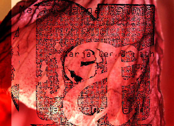
Oh, and the image above is the result of some play with text and image layers in PhotoShop... enjoy!
Marja-Leena | 14/03/2010 | 15 comments
themes: Blogging
The glowing red transparent image looks like a message in a sunrise. I like the font you use very much. But I am sure if you change it I will like the new one as well.
Catching up here, I've enjoyed the richness of your textures. You have me looking at things in my own environment differently which seems to me what art should do. Also like the new look of the blog. Wish I had an Erika in my life!
Anne, thanks for letting me know, so generously as always.
Patry, it's always a pleasure to have you here, and I'm so pleased you enjoyed my textures series, as well as the blog's new look. Yes, I'm lucky to have Erika!
The more artistically pleasing the font, the less easy it is to read. Takes me back to my working days and the enduring arguments I had with the artists who designed the magazines I edited. "Who wants boring Times New Roman?" they'd say in a sulk after I'd slapped down their proposal for Chinajavacalligraphic Extreme Condensed. The problem was the artists didn't read the text, they saw it as a greyish rectangle of design. So legibility didn't matter. TNR may have been around a long time but there's a reason. It's legible. For the same reason I'm a fan of serifs - otherwise how can you tell the difference between a l/c l and a cp I. Happy days.
BB, as you can see, I'm fond of sans serif, call them artistic if you like! To my eye, they are simpler and cleaner. Form and function, both design and legibility do matter. Both serif and sans serif have their good and bad styles and I've learned a lot from Erika on what makes a better font. I'm still not crazy about what I have here but the ones I preferred most cost money and since I don't make any money with this blog, in fact I pay fees for the domain and hosting, I could not justify the additional expense.
This is the same font as on my blog. I blush to admit that I can't remember what font you were using before.
Hattie, really? I like it on your blog better for some strange reason. I had Skia before, but if you're on a PC it would have likely appeared as Verdana.
I like the new font very much and love the larger image size. I'm going to have 600-wide pix when I relaunch my blog - this has been the one non negotiable factor as I've spent long hours lately playing with different layouts.
I kind of agree in principal with Barrett Bonden about serif fonts, but I find Times less pleasing to the eye on screen than I do in print and cannot bring myself to use it. Since on-screen text can be larger and spacier than print usually can, I think that compensates somewhat for the fact that sans serif fonts are a bit harder to read.
Jean, 600-wide pix sounds marvelous (mine is 585). I look forward to seeing your new blog! I think fonts can also vary in how they look on different screens. This morning I had a look at this page on the studio's newest Mac with extra large monitor, the latest technology - and wow, does it look crisp.
Am exhausted after several strenuous days at work this week, yet your new font is easy on my bleary eyes, Marja-Leena. The print looks good on my 2" Nokia mobile screen. The photos are fuzzy as usual, but I can make them out. I have to wait until I'm able get to the library to see them in their full glory.
R, thanks for letting me know. You've mentioned your Nokia before, but surely you have a computer at home as well or do you always use the library's? Hope work gets less strenuous for you.
Lovely print! I like the larger size photos so I can see your work. Although I just realized I can boost the size of even your photos by using ctrl/+! (thought that was only for increasing text size) My new blog design allows for larger photos, but I haven't tried doing that yet, maybe because my laptop screen is so small. My screen at work is nice and large, but then I'm not supposed to be blog surfing there. :-)
Marja-Leena, no computer at home yet, I'm afraid. I've been saving, so perhaps this will be the year! The library has recently cut its operating hours (budget constraints) and they are unable to replace the computers that break down, so it's a dire situation at present. I've had to rely more and more on my Nokia. Thanks for your work wishes; I see light at the end of the tunnel today! Hurrah!
Lovely print. I like the strength in the colour, and the design.
Leslee, yes, if you enlarge the font the image becomes larger too. That came about when we updated the Movable Type to the latest version a couple of months or so ago, a setting I didn't know about before. However some images end up looking blurry I think. Anyway, thanks for pointing that out for anyone unaware of this feature. In Safari, I toggle between the two A buttons on the toolbar.
R, oh my, I'd be hard pressed looking at websites on such a tiny screen, even husband's iPod Touch. These cutbacks are happening to some extent here too. Hope you'll soon be able to get your very own, it will feel like luxury!
Anil, thanks, it does have those lovely hot Indian colours. I just made this image on the computer using my name but hmm... I just might print it.