Peter Frey exhibition

PeterFreyInvite.jpg

I am very pleased to introduce friend and fellow-printmaker Peter Frey. Peter is presenting Threads and Fissures, an exhibition of his photographs and prints at the Capilano College Studio Art Gallery.

Opening reception: Thursday, November 9th, 4pm – 7 pm.
Exhibition runs November 9th until December 5th, 2006
Gallery hours: 8:30am – 4:30pm Monday – Friday
Capilano College Studio Art Gallery
2055 Purcell Way, North Vancouver, BC
A Google Map for directions.

Here is Peter’s artist statement:

I began expressing myself through art quite late in my life, when I was living in India, where I studied and practiced a form of yoga called Darshan Yoga – Yoga of Perception. Ideally, when one is in a state of perception, one is fully engaged and the thinking mind is quiet and the exquisite richness of life, the inner and the outer world have an opportunity to touch us.

For about 4 years in India, the photographic camera took me from the inner world of meditation outside into fields, villages and mountains. Photography became a means to look at and admire the world in a simple and direct way. When I left India, I began to study photography in a formal way, both in New York and later in Chicago, and my work became more self-reflective. I began to include my own body in the work to speak of the relationship between the self and the world, between the inner and the outer.

I have chosen for this exhibition a few works from that period. Most of the work shown has been made since becoming a member of the art institute here at Capilano College.

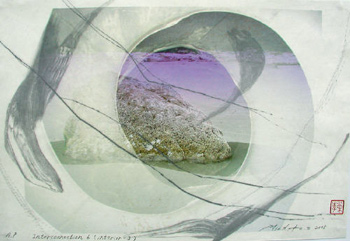
I have used the word ‘threads’ for one of the names for this show to indicate the idea that there are common threads, or themes linking together these pieces, which span a period of about twenty years. But the threads that link and hold together, that hold my attention fully engaged in my creative work, sometimes break.  These threads that link become the fence that separates, what has been flowing easily is interrupted, what has been whole breaks – and I am disappointed. But there is an other side to such breaks, fissures, cracks, ‘mistakes’, which is perhaps expressed when we speak of breakthrough and which Leonard Cohen has so beautifully put in this line:” there is a crack in everything, that’s where the light shines in”. A crack is also an opening.

Recently I attended a sweatlodge, where volcanic rocks, heated in a fire, are used in the lodge. One of these rocks, redhot, had a crack halfway through, and it was through that crack that the red glowed with the greatest intensity. In a way the material disappeared and only the light remained, and one was able to look deep inside. Just like the intense glow of this rock soon dimmed, moments of creative intensity, of deep connectedness, of glimpses deep inside the fabric of something, rarely last very long and the sense of loss, the breaking of this connection, this fissure, I think can be seen in some of the figures that appear in my work.

A word about my choice of materials and medium:
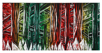
Printmaking provides a means to create very fine textures. For my eye, fine texture acts in a similar way as very fine fabric, it is sheer and does not cover. Like a veil it allows us, hopefully, a chance to see a little inside, behind the surface, behind the picture plane. In this way I also see the series of leaves shown here less as forms and more as openings, or windows through which one might gaze into a landscape that is at once minute and very large in scale.

PeterFreyImage2.jpg
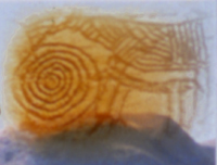
Spontaneous Alchemy: OM/MO 2002. ©Peter Frey, monoprint

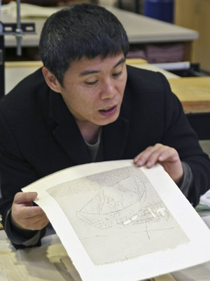
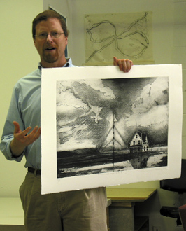
UPDATE Nov.9th: We’ve just come back from the opening. It’s a stunning show with a large body of work, consisting of photographs, mixed media works and inkjet prints. If you are in the area or coming to town, do come see it! Here’s Peter next to his piece Leaf from Petals/Reversal, an inkjet print with coloured pencil:

PFreyLeafPetalsRev.jpg

Japanese woodblock printing

printing&cutting.jpg
A few days ago, Tae-Huk Kim, our artist-in-residence from Korea, gave us an excellent demonstration of traditional Japanese woodblock printing. This is the technique he uses for making his contemporary woodcuts.

Several woodblocks are made, usually one for each colour, so registration of all these is critical. Kim begins with the first block that has been cut with the desired image plus the registration marks in two locations. He wets this block with a wide brush and water, then squeezes watercolour from a tube (any kind is fine) and some wheat paste, and brushes these around and up the cut relief areas. You can see his brushes in the left photo above, and also how the paper has been laid over the inked block, and Kim is rubbing the back vigorously with a baren (the round disks in the right photo above). Thus he makes a print.

Now he takes a clean uncut woodblock, wets it, applies Japanese glue over it evenly and places the print on top. This he allows to dry for about 15 minutes, then rubs the paper off, leaving behind the printed image. This becomes a cutting guide for the next colour area and is repeated for consecutive colour blocks.

The cutting tool that Kim favors most of the time is a traditional Japanese blade with a wood handle – note in the right photo above how he holds this with his fist at an angle, pulling towards him as he cuts along the edge of both sides of a line. Some western style woodcutting tools with curved blades have been taken into use now primarily for cutting away the open areas that will not be printed, and these are pushed into the wood. Kim also demonstrates how the tools are sharpened using Japanese water stones.

woodcut&barens.jpg

The left photo above shows one of the cut blocks. The raised or relief areas are what will be inked and printed. The white area on the right is a cut grid pattern inked white, while the center area and a border line are inked orange. On the left is a relief area that is left uninked as support for the paper. The registration marks are somewhere along one edge but can’t be seen in this photo.

The Japanese baren that is used for printing is a fascinating tool, consisting of up to 52 layers of lacquered Japanese paper on the outer disk. The inner disk, which Kim is holding in the right photo above, is made of tight rings of fine bamboo rope. The outer working surface is made of bamboo skin that is wrapped and tied to the disks, and is replaced as it wears out – an interesting demonstration of this too! It is time consuming to make the entire baren and costs about $500 each to buy! Kim says he sometimes makes them himself when time allows.

inking&thePrint.jpg

The second colour woodblock, once cut, is soaked with water and animal glue for a while. Then yellow watercolour and wheat paste is applied and brushed (see photo above left). This is printed over the first orange and white print, using the baren. There’s the two colour print in the right photo held up by Kim on the right and Wayne Eastcott, printmaking faculty, on the left.

Kim usually uses Japanese Kozo paper which he dampens and leaves in a plastic bag overnight before printing as well as between each colour printing.

I asked Kim if this method is the same as that used in making the famous Ukiyo-e Japanese woodblock prints produced between the 17th and the 19th century. Kim said it is very close but with the addition of some modern day tools, and adapted to his contemporary images.

Thank you, Kim, for this excellent presentation! I kept thinking about how easy this method of printmaking would be in a small home studio – no printing press and no toxic materials!

I’ve given fairly basic and minimal information here, so if you are interested in more information, check out the numerous links in Wikipedia’s article on Japanese woodblock prints, including an online demonstration, as well as the Handbook of Japanese Printmaking Technique.

Oh, and don’t forget Kim’s exhibition opening tonight if you are in the area!

printers and scanners

In the comments to yesterday’s post about my experiments, virtual friend and artist-blogger in Alaska, Elise Tomlinson asked some very interesting questions, which have inspired me to write today’s entry.

So, do you have your own printer and scanner for doing giclees? I am so intrigued with the whole process of them. Right now I get them done by a local print shop, they are reproductions of paintings I’ve done…but I’ve heard of other artists with their own printers/scanners who use the new technology to produce what I would consider to be original fine art prints (using your definition) conceived of originally as a print, where they control the amount of ink, the paper, etc. What are your thoughts on that? Also, if you do have your own equipment, would you mind sharing what brands you own?

I first wrote nearly two years ago about the tools that I use and later about the studio where I make my prints – you might start reading these first for a background.

At home I still use my old (1997) Umax Astra 1200S scanner though it’s SCSI and has to be connnected to an old Mac G3 which I can access at my Mac G5 via the network. It’s slow and a bit inconvenient but I haven’t wanted to spend the money on a new one with a fast Firewire connection because I do like its 8.5 by 14 inch bed.

When I need to do some high resolution scans for my large printworks, I use the studio’s scanner, an Epson Professional (I’ll check the precise model tomorrow), which allows slide and film scanning too. (It’s 1680.)

I still use my HP Deskjet 1220C 13″ printer at home, one I chose because the studio has one, as does the technician herself in her home studio, and it’s proven to be a real workhorse. It uses water-based dye ink, which is not fully archival ie. more than 80 years, though still very good. I use it for small projects and proofing my work in a smaller scale before printing at the studio’s 42″ HP 5000UV which is fully archival with waterproof UV pigment inks. The experiments that I wrote about yesterday were done with this studio printer.

It is a high end professional machine that has been very durable, reliable and gives excellent results. It’s just that some artists like yours truly are pushing the medium further and expecting it to do more than it was designed for!! Newer models offer more features of course. One of the Institute members recently bought himself an Epson 7800 (I think) that is 24″ wide, with adjustable heads to allow thicker materials and with a straight feed for rigid surfaces. So for my problem with the organza, his printer might work better!

And my thoughts on giclee printing? Please read prints vs reproductions.

Tae-Huk Kim exhibition

KimTae-HukInvitation.jpg

Regular readers may recall my post about our print studio’s artist-in-residence Tae-Huk Kim. Since his arrival in November, Kim has been busy making new woodcut prints using traditional Japanese water-based woodblock techniques. Next week he will be giving a demonstration of his technique followed by an exhibition of his works. Here are the details:

Monday, February 13th, 2006 11:30am – 1:00pm: Demonstration of Tools, Woodcutting and Printing

Thursday, February 16th, 2006 11:30am – 1:00pm: Walk Through Exhibition and Powerpoint Slide Show

Thursday, February 16th, 2006 4:30 – 7:30 pm: Exhibition Opening Reception

The exhibition is on from February 14th to 27th, 2006

Studio Art Gallery, Capilano College*
2055 Purcell Way, North Vancouver, BC
Gallery hours: 10am – 4pm Monday – Friday

To find your way to the North Vancouver Capilano College* campus, check out Google maps. Everyone is welcome!

* since then, the college has been designated a university

Mohsen Khalili exhibition

mohseninvite.jpg
(scan of the front of the invitation showing Mohsen Khalili’s unique bronzes)

Art Institute member and everyone’s friend Mohsen Khalili is having an exhibition called DYSFUNCTIONED TOOLS at Gallery Jones. Featured will be his numerous small bronze sculptures and mixed media drawings.

OPENING: Thursday, February 2, 6-9 pm
1725 West Third Avenue, Vancouver, B.C
Exhibition Dates: February 1-25, 2006
HOURS: Tuesday – Friday 11 – 6pm, Saturday 12 – 5pm

So mark your calendars and come out to see Mohsen and his moving artworks. You can view some of his work on Gallery Jones’ pages, and especially at Mohsen Khalili’s own website, where you can also see some of his prints as well.

mohseninvite2.jpg
(scan of a section of the other side of invitation displaying Khalili’s Anti-art #14)

Tae-Huk Kim

Tae-Hug-Kim.jpg
Tae-Huk Kim – Photo by Robert Jackson

The Art Institute Printmaking studio at Capilano University* is very fortunate to have Tae-Huk Kim as artist-in-residence for six months. Kim, as we call him, is a native of Korea who has been studying printmaking in Tokyo National University of Fine Arts and Music, under the mentorship of Professor Tetsuya Noda, an internationally well-known printmaker. In April, 2005, he received a PhD in Printmaking, possibly the only degree of its kind in the world. Kim uses traditional Japanese woodblock techniques to create contemporary works on Japanese papers such as Kozo.

Soon after he arrived in November, when unpacking his prints, Kim gave us an informal introduction to his work. Robert Jackson, one of the Institute members, luckily had his camera with him and took several great photos, which he’s kindly allowed me to choose from and post here. We are all looking forward to Kim’s exhibition in the Studio Art Gallery in February and to his talks and demonstrations of his techniques, and I’ll write more then. Kim is very friendly and generous with his knowledge and we are all enjoying having him here. It’s one of the many great things about this studio!

KimPrints.jpg
Kim’s prints – photo by Robert Jackson

ADDENDUM and CORRECTION Dec.9th, 2005:
Apologies to Kim for misspelling his name, which is now corrected. Now that I have his name right, Google search results reveal an internet presence to match his reputation! He’s been a prize winner at the 12th and 13th SEOUL-SPACE INTERNATIONAL PRINT BIENNIALs in Korea.

And you can see examples of his work on the websites of two Tokyo galleries : the Shirota Gallery presents the “imperfection in space” series and Yoseido Gallery features several works.

* UPDATE Decmeber 2013: The Art Institute program was cut in May/June this year, so link is obsolete and has been removed.

Interconnection: Eastcott / Suzuki

EastSuz-Interconnection6.jpg

Interconnection 6 (Interior 3)
Michiko Suzuki & Wayne Eastcott
inkjet, toner etching and Japanese paint on torinoko paper

In August 2004, I wrote about a fascinating collaboration between printmakers Michiko Suzuki of Tokyo and Wayne Eastcott of Vancouver. They had a very successful exhibition in June, 2005 in Gallery Concept 21, Tokyo and now it will be exhibiting in Vancouver.

Interconnection – a transpacific printmaking collaboration
November 3rd to November 20th, 2005
Opening reception on Thursday Nov. 3rd, 6:30 – 8:30 pm.
Elliott Louis Gallery, 1540 West 2nd Avenue, Vancouver

Fortunately for internet gallery visitors, Elliott Louis Gallery has a good website**, with a press release and images of the works, and the artists’ statement:

It is dangerous for many artists, who are individualists, to attempt a collaboration. But we believe it is possible within the printmaking world. Print artists require the use of both human hands and tools (traditional or new). Therefore, the artist must depend upon outside processes not only themselves. Already printmaking is a kind of collaboration with some hidden potential.

This exhibition is the result of a collaboration that we commenced in 2002. However, the first work was not complete until the fall of 2003 because we spent many months (Tokyo – Vancouver e-mails, telephone calls, faxes etc.) trying to really understand each other’s interests, ideas and aesthetics. We wanted it to be a true collaboration and not merely two artists working on the same piece of paper.

The project is called Interconnection because it represents an interconnection on many levels: between ourselves as individuals, our cultures (Canada / Japan), the classically etched and digital generated images, the natural, human, technological forms, even the paper (classic Japanese Washi or Western papers etc.)

Finally the works are brought to completion by another interconnection: that between our pieces and the viewer.

The Japanese Consul will be attending the opening reception and Vancouver’s Japanese-Canadian media are covering this exhibition generously, including multicultural Radio CHMB AM1320 doing a live interview of the artists on November 2nd, 2005 from 7 – 8 pm.

** NB UPDATE: JUNE 1st, 2006. Wayne Eastcott and Michiko Suzuki are now represented by the new Bellevue Gallery, 2475 Bellevue Avenue, in West Vancouver. Therefore the former linked pages no longer exist and have been removed.

Fred Brown’s woodcuts

FredBrownShelter.jpg

Fred Brown: Share the Shelter
Woodcut 36″ x 72″

I had heard that printmaker Fred Brown was going to be having an exhibition this month in Vancouver. Imagine my surprise when I read Art Daily’s posting “Power Tools, Plywood, and the Artist take Vancouver” and that artist turns out to be Fred!

“The Devon Gallery is proud to host Vancouver’s first major showing of the nationally renowned woodblock print artist, Fred Brown the Artist, and challenge the perception that fine art and the creation of fine art are generally considered the stuff of high society. This perception is challenged when an artist gets supplies from the local hardware store. Using plywood instead of canvas and power tools instead of a brush or pencil, Fred Brown the Artist creates fine art in the form of woodblock prints.”

Fred is showing his woodcuts at the Devon Gallery, 688 Denman Street, Vancouver, BC, to October 11, 2005.

His work can also be viewed at his website FredBrowntheArtist.

I’ve seen Fred working on his amazing huge woodcuts in the Art Institute studio where he’s been printing from time to time over the past several years. I’m sorry I missed the opening on Friday and will go and see the exhibition soon.

Dan Steeves

DanSteeves.jpg

Dan Steeves is presenting a series of printworks ‘The House as Fortress, the dichotomy of symbolic structure’ at The Lookout Gallery, Regent College, at UBC, Vancouver until October 14th.

Yesterday we were pleased to have artist Dan Steeves visit as guest speaker in the Printmaking department of Studio Arts, Capilano University**. He teaches printmaking at Mount Allison University in Sackville, New Brunswick, his home province.

Dan Steeves showed his recent works that are in the exhibition as well as numerous older works. A warm and gifted speaker, he described his techniques in his chosen medium of etching always in black and white. His method is slow and painstaking as he works from black to white. Frequently reusing old plates sometimes allows him to incorporate old textures and “ghosts” to great effect.

Informed by his Atlantic Canada roots, Dan Steeves often uses images of local old houses and public buildings as a metaphor for sanctuary, security, safety, OR as fortress in the negative sense. His stories behind each work were fascinating, personal and sometimes heart wrenching. Someone in the audience said, “I almost want to cry”, to some empathetic laughter from the rest of us. His prints really are very evocative and beautiful both technically and spiritually.

Dan Steeves finished by saying to the students that no matter what medium or style you choose to work in as an artist, it must come from the heart and not be just the fashion of the day. (Or something like that, I didn’t get a chance to write it down.)

Do enjoy a look at Dan Steeves’ work at his website.

**Since writing this, the College has since been designated a University so name and link have been updated.

in the printshop

detailSilMessHoodII.jpg
Detail from Silent Messengers: Hoodoos II

For the past week I’ve been happily back at the printmaking studio, my home away from home sometimes it seems. A new season always means new people and a new energy that I enjoy. We’re all pleased to have Michiko Suzuki back as artist-in-residence, continuing the collaboration with Wayne Eastcott. Wayne and Michiko had a very successful exhibition in June in Tokyo that I look forward to writing about in some detail soon.

After a summer hiatus it always seems to take a little time for most of us to get a momentum going on our projects, particularly the new people as they familiarize themselves with the shop and learn some printmaking techniques if they are new to the medium. I get into a creative mental space by looking over my sketchbook, notes, photos as well some of my last work as I plan new prints for my ongoing Silent Messengers series. An exciting incentive for me right now is a solo exhibition in November to prepare for, and I will be writing about that as well this fall.

Later today we have a visiting printmaker from New Brunswick coming in to talk about his work while he’s in town for his exhibition – watch for my next post on that.