three art exhibitions

running right now which I dearly wish I could visit:

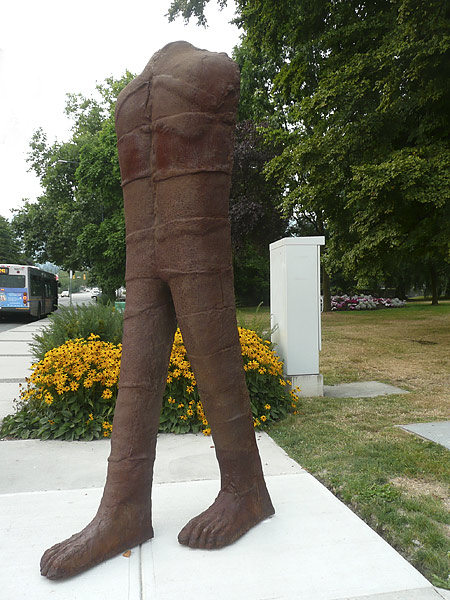
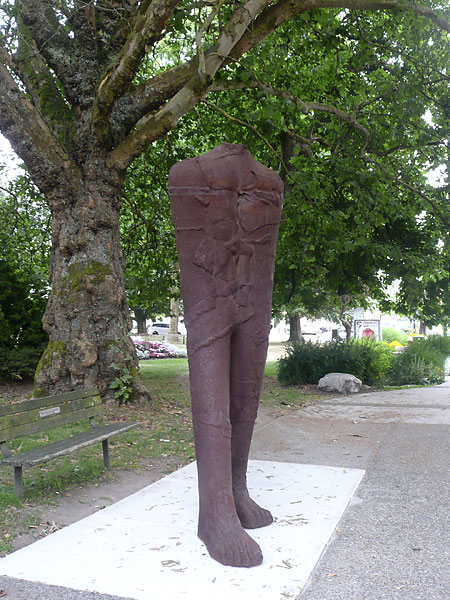
1. Anselm Kiefer at the Royal Academy in London. I have long loved his work and follow it online. I was so very lucky to see one of his shows in Munich in yr. 2000 – wow! Be sure to also visit the link to Kiefer’s astonishing 200-acre art studio! I always appreciate Jonathan Jones’ comprehensive reviews.

2. The late and great Canadian artist Alex Colville at the Art Gallery of Ontario. There is even a link to a wonderful website in his name that seems to show most of his long life’s work.

3. Hokusai at the Grand Palais in Paris, thanks to a post by Charles T. Downey of Ionarts. You know how I love printmaking and the Japanese masters.

Because I don’t travel far these days, the internet does compensate a bit. I’d love to see photos and reports from any readers that do visit any or all of these shows.

Added November 3rd, 2014: My good blog friend, artist Olga Norris went to see the Anselm Kiefer exhibition and found it monumentally visceral.

And the very next day, artist and friend Natalie d’Arbeloff wrote a superb review of Kiefer’s work along with some excellent links!

I am sooo envious.

Added November 26th, 2014: In a comment at a later post, Olga Norris mentioned an excellent and powerful review of the Kiefer exhibition, the best I’ve read about this artist. It’s by a blogger new to me and whose blog That’s How the Light Gets In looks rich in material so I have bookmarked it for further reading.

Abakanowicz: Walking Figures

Abakanowicz_WalkingFigure

Abakanowicz_WalkingFigure2

Abakanowicz_2WalkingFigures

_Abakanowicz_Figure_Foot

The second installation of sculptures installed by the Vancouver Biennale in the City of North Vancouver (in addition to Wang Shugang’s sculptures) are the Walking Figures, a group of headless cast iron figures by one of my favourite artists, Magdalena Abakanowicz. These are installed individually on the sidewalk over several blocks of Lonsdale Avenue.

I still remember well Abakanowicz’ similar stunning figures called Vancouver Ancestors, set together as a powerful group on a grassy slope in Queen Elizabeth Park in 2006, also part of that year’s Vancouver Biennale.

Though I did not have the time to visit all the Walking Figures, I was excited to see several of these. Yet I did not feel these had the power of the Ancestors because they stood alone and apart next to a very busy street. I can understand the reasoning for this kind of installation – to expose art to people in their daily movements on the street, so much more prevalent in many European cities. In my short time there as I took photographs, I also observed the human traffic and it seemed not one person paused to look at them, though maybe some had already viewed them earlier if they regularly passed by them.

There are a couple of interesting links (as pdfs) at the Biennale site if you desire more information:
about the installation
about the artist

Wang Shugang’s “Meeting”

WangShugang_TheMeeting

WangShugang_TheMeeting2

WangShugang_TheMeeting3

WangShugang_TheMeeting_detail

As part of the Vancouver Biennale for 2014 – 2016, some installations of sculpture are on display in North Vancouver City. Yesterday evening we happened to be in the neighbourhood of Ray Sargent Park on Lonsdale Avenue, right by the Gordon Smith Gallery of Canadian Art (seen in the background of the second image). I was excited to view the works of two internationally noted artists’ works.

The first group of figures, made of painted bronze, is by Wang Shugang of China.

It is not without irony that the red figures are placed in a circle, static and crouching with cupped hands, open to various interpretations, from one of thoughtful contemplation to one of latent energy ready to leap up. Wang Shugang’s installation for the Vancouver Biennale, Meeting, is painted a shade of red that is known as Chinese Red, the colour associated with the Chinese government and communism.

According to the artist, “… the colour red has multiple cultural meanings in China, historically representing happiness but during the Cultural Revolution it symbolized terror. Today red is the colour of the faded lettering praising Mao on the ceilings of the factories, coats of the Buddhist monks and the colour of wedding decorations”.

Besides noticing the sense of contemplation mentioned, I felt that there is some humour here as well! Children do love them. I’m only sorry that the light was not ideal for photography at this time of the evening so please visit the link for better photos and also more information about the artist.

(I will show photos of the other artist’s work in the next post.)

read these

collagraphCard

Instead of words from me, here are some suggested readings, both related to textiles, which inspired me this week:

On Thursday June 12th Charllotte Kwon, owner of Maiwa Handprints and founder of the Maiwa Foundation, received an honorary doctorate from the University of the Fraser Valley for her work empowering artisans from developing nations and battling poverty by providing a market for their traditional crafts. Read her wonderful address to the audience.

A rare, 2000-year-old funeral shroud went on display at a museum in Lima, Peru. The pre-Incan, fragile textile is part of Paracas textiles that Sweden is returning to Peru. Stunningly gorgeous work that has preserved for so very long. Do check out all the links in this article to see some of the work. Many thanks to Susan for sending this to me!

Image above: A section from a collagraph test print which I later made into a card.

a modern petroglyph

Xwalacktun_petroglyph

Xwalacktun_petroglyph2

Xwalacktun_petroglyph3

GenerationalPetroglyph_text

Xwalacktun (Rick Harry) is a well-known and recognized and very prolific First Nations artist who studied in Emily Carr College of Art and Capilano College in Greater Vancouver. Recently I was excited to see one of his latest works, a petroglyph called GENERATIONAL Pictograph Petroglyph SITES at the Squamish Lil’Wat Cultural Center in Whistler. As I have long been fascinated by ancient petroglyphs, this modern one intrigued me greatly. I love it!

a box of promises

On our recent drive up to Whistler, a visit to the beautiful Squamish Lil’Wat Cultural Center in town was a must for us, after last year’s inspirational visit. We spent most of the time upstairs where the temporary exhibits are displayed, and a new one had just been installed. Below is the first piece we loved. I’ll feature the other favourite in another post.

Box_of_Promises

Called Box of Promises this stunning piece slowly rotates revealing the play of the patterns in varying relationships.

BoxPromises_detail

looking inside

BoxPromises_detail2

looking underneath

BoxPromises_text

A fascinating collaboration by two artists from two different cultures and with a very thought-provoking title.

Burtynsky at VAG

Yesterday we finally went out to see A Terrible Beauty: Edward Burtynsky which is in its last week at the Vancouver Art Gallery. It is a focused survey of photographs the artist produced between 1983 and 2013, and represents all key bodies of his work, such as early series of homestead and rail line photographs shot in British Columbia in the early 1980s, his documentation of the extraordinary growth and transformation of China in the past decade and a new, groundbreaking international project that is focused on the subject of water.

What a stunning exhibition with forty-four of this Canadian artist’s work, some of which I’ve seen in the past. The works are so very beautiful aesthetically, yet very shocking and disturbing once we realize what we are really looking at — the many examples of massive destruction of so much of this earth by industry, railroads, farming and other human activity.

Burtynsky is very particular about his images and does a great deal of research, planning and eventual manipulation on his photographs before printing in very large format. Sometimes they even look like paintings and they are all works of art, not just documentary photographs.

Most of Burtynsky’s exhibited photography (pre 2007) was taken with a large format field camera on large 4×5-inch sheet film and developed into high-resolution, large-dimension prints of various sizes and editions ranging from 18 x 22 inches to 60 x 80 inches. He often positions himself at high-vantage points over the landscape using elevated platforms, the natural topography, and more currently helicopters and fixed-wing aircraft… In 2007 he began using a high-resolution digital camera. (from wikipedia)

The timing of our visit did not work out for us to see his two films “The Manufactured Landscape” and “Watermark”.

Do visit Edward Burtynsky’s extensive website!

More:

– watch the video above or on Vancouver Art Gallery’s site with an introduction by the artist and Bruce Grenville, Senior Curator

– another video and an excellent interview by Kevin Griffin in the Vancouver Sun, discussing the artist’s process

– a good article in Galleries West magazine, Spring 2014 issue, pages 32-26

– check out my previous posts in June 2004, May 2005, October 2006. Some links have since expired.

ADDED May 2nd: Our daughter Erika visited this exhibition with us. Please read her profound thoughts on it here.

new Old Main

NewOldMainTRU

NewOldMainInterior

MountsPeterPaul

As mentioned before, we were visiting Kamloops last month. Besides art exhibition visits, our daughter took us for a tour of part of the lovely campus of Thompson Rivers University, sited on a mountain top overlooking the city. Knowing our interest in innovative, sustainable and energy saving architectural design, she was eager to show us the recently completed renovation and expansion of the Old Main building. Yes, we do love the modern design, the undulating roof, the numerous windows bringing in the light and the views, especially north over the city and the mountains.

This building now houses the new Faculty of Law, the first new one in Canada in thirty years. I became even more intrigued by the story behind the inspiration for the architectural design:

The design firms looked to the splendor of Mt. Peter and Paul to create an expansive design that undulates and curves, and were inspired by Mount Paul, by A. Y. Jackson. The result is a spectacular undulating roofline that mirrors the Kamloops horizon.

You can see Mounts Peter and Paul in the bottom photo. It took much searching to find Jackson’s painting – it is in the collection of the Kamloops Art Gallery, to be found on this page (scroll down and down, it is the fourth from the bottom). For copyright reasons, I hesitate placing it here. A.Y. Jackson was a Canadian artist, part of our noted Group of Seven. He took many painting expeditions all over Canada, including BC and the North.

goodbye Joe & Heidi

Joe_Heidi

Joe Hyam, 20.9.1933 – 10.3.2014 and Heidi Rudloff Bush, 28.6.1938 – 22.12.2013

Saddened by the passing of Heidi just before Christmas, then Joe Hyam of Now’s the Time so soon after his wife, I have been without words. Many others have written about them and their friendship more eloquently than I ever could and I nod to them – please see links below.

I delved into our UK 2009 travel photos and found a precious few of our wonderful but short visit to Tunbridge Wells. Joe is well-known I think for being rather camera shy but Fred sneaked this quick shot in his beloved study just before we headed out for a walk in the town. (I tried to remove my image but it only spoiled the background.) I wrote back then about goodbyes, preferring the less final näkemiin or auf wiedersehn. It truly is now a goodbye while that day is even more precious a memory.

Lucy of Box Elder, a most eloquent and prolific writer, friend and collaborator with Joe on Compasses wrote these:
– a hauntingly beautiful poem on the loss of Heidi
– how she met Joe thanks to onions and about her scheme to go to Joe’s memorial
– about the trip and the memorial, along with links to others

Roderick Robinson of Tone Deaf, who has known Joe for decades, wrote several times:
– the first notice that I saw about Joe’s passing, a tribute to their long friendship, and more
– the day of the memorial
– He and his wife also attended Heidi’s memorial but I was unable to find the link about it. If Robbie reads this, perhaps he’ll send it in a comment below.

The Crow wrote a touching goodbye which reflects so well the amazing connections and friendships that come through this blogging medium and which I also feel deeply.

Added May 3, 2014: Joe’s brother Ken aka Lucas of Pomesonpoets has written a poignantly beautiful poem: A Ballad for Joe and Heidi.

Eyes as Big as Plates

EyesasBigasPlates#Agnes-II

Eyes as Big as Plates # Agnes II © Karoline Hjorth & Riitta Ikonen

EyesasBigasPlates#Velkkari

Eyes as Big as Plates # Velkkari © Karoline Hjorth & Riitta Ikonen

The first time I saw Eyes as Big as Plates and its many amazing photographs of elders set in nature, wearing materials from the earth, blending with the earth, sometimes half lost in moss or pond, I was completely stunned and awed by all of it. Learning that the artists are a Finn, Riitta Ikonen and a Norwegian, Karoline Hjorth explained a lot behind my feeling of a deep connection to the images – our Nordic roots, folklore and nature.

Riitta and Karoline worked with volunteer elders in Finland, Norway, New York, France, Iceland and the Faroe Islands. (I must say the settings in Iceland are the most dramatic!) They captured a wonderful sense of beauty, wisdom, humour and love of adventure in these models in their various home places.

This body of work has stayed with me as some of the most exciting I have seen. I have followed their blog since and now learned that they will have their first comprehensive solo exhibition of Eyes as Big as Plates in Oslo, opening January 23rd. How I wish I could be there to see the work and meet the artists!

Many thanks to Riitta and Karoline for permission to use a couple of their photos. Congratulations on your stunning project and best wishes for your continuing successes! It would be wonderful if their exhibition were to come to Vancouver!