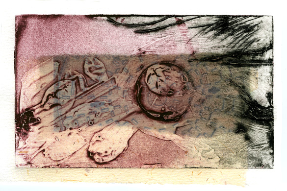
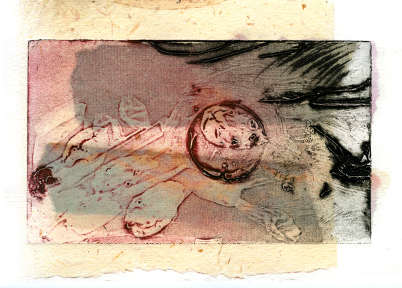
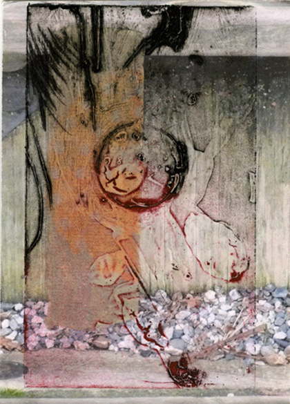
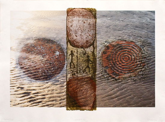
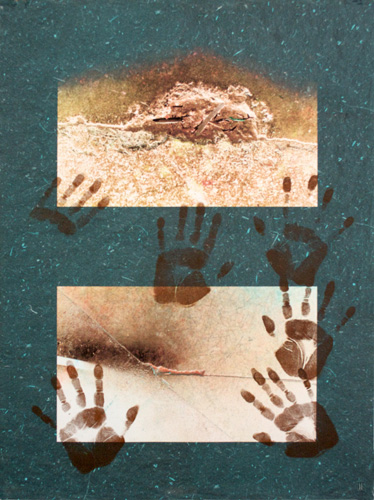
Exhibition: Chang-Soo Kim

ChangSooKimInvite.jpg

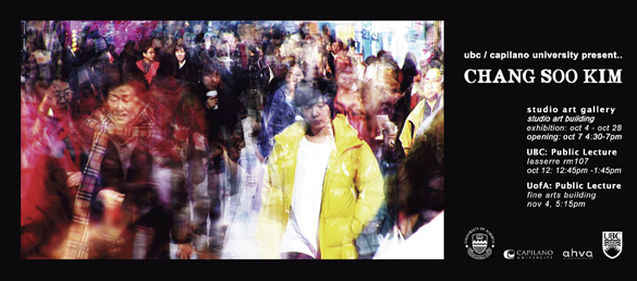
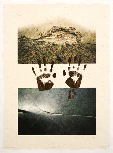
Chang-Soo Kim is an award winning photographer and printmaker and a professor at the college of art at Kyungwon University, Seoul, South Korea. He is visiting Vancouver and Edmonton with the following events, organized by University of British Columbia (UBC) and Capilano University.

Exhibition: Studio Art Gallery, Studio Art Building at Capilano U
Oct. 4 – Oct. 28, Opening: Oct 7th, 4:30 – 7 pm
Public Lecture: UBC, Lasserre rm. 107, Oct. 12: 12:45 – 1:45 pm
Public Lecture: University of Alberta, Edmonton, Fine Arts Building, Nov. 4, 5:15 pm

Everyone is invited to all events. For directions to Capilano University in North Vancouver, check out Google maps. And here is the campus map, pdf.

We at Cap are looking forward to meeting Chang-Soo Kim and getting to know his work and we hope to see you at the opening if you are in the Vancouver area.

I could not find a website for the artist, but if you are interested you may view the artist’s CV and a Description of Works (both are pdfs).

Added Oct.6th: Here is a page of great photos of Chang-Soo Kim’s artist talk with a class at UBC.

Added Oct.23rd: See some installation photos here.

little test prints

testcollagraph2.jpg

It’s been quite some time since I’ve shown any of my printmaking projects. I still haven’t uploaded the series I finished in the fall and in January…. soon, I hope. So readers might be interested in these little test pieces that I did a while ago.

testcollagraph3.jpg

Wanting to try out a special technique called chine-collé, as well as have a little fun, I chose a small collagraph plate I had from earlier tests and some sections from older inkjet proofs to print onto. I tore small pieces of very thin inkjet printed papers, applied special glue on these and placed them on the inked collagraph plate just before it was run through the press.

testcollagraph4.jpg

I learned that the inkjet colours of these particular chine-colléd papers were not waterfast but they were still fun little pieces to do while learning a few new things. Later I experimented with prints from another printer with waterproof inks that worked better though I didn’t like the images as much.

These are shown here about life size.

on this day

UnknownBerries.jpg

JapMapleLeaves.jpg

orangeLeaves.jpg

This morning in the printmaking studio was somewhat frustrating for me. Lucy, our trusty and faithful wide-format printer was not happy. I’ve been trying to print a trial proof of a template image for my next series of prints. (I’ll tell you soon about the ones just finished.) I need to be sure the layout is right before I start placing the images on the page so I don’t have to redo them all. But Lucy now has a fancy new computer with the latest new OS and she’s making strange. Our fab technician and the IT person have been working on it the past few days but it still wasn’t working for me.

Somewhat dejected as I bussed home this afternoon, I paused along the path home to admire the fall colours hanging over a weathered leaning fence. Being without a camera, I impulsively picked a few small branches to scan at home. I haven’t posted any fall colours or done any scanning for a while so that made me feel better!

I also had a wonderful surprise awaiting when I opened my computer. Today Qarrtsiluni posted my ARKEO #4 along with a fabulous podcast by the editors Beth Adams and Dave Bonta. I think they made interesting observations, including the comment about emerging language. It’s always heartwarming to feel that one’s work is meaningful to others. I felt inspired by the current theme, Words of Power, so I’m very honoured to have my work included in qarrtsiluni again. Founding editors Beth and Dave have done such a fantastic job of this amazing online magazine and deserve a round of applause! If you don’t know it, do please check it out.

UPDATE Nov. 6th: I must tell you more about Lucy’s naming! This morning Bonnie, our technician, was showing me the small changes that had been made yesterday to restore Lucy’s operation. As I prepared to print, I told her about how amused some of you readers were concerning the fact that we have a name for this printer. Bonnie said she got the name from her brother’s old grey car. And get this: her brother is very interested in history and old things, so my thoughts of the early hominid Lucy were right on the mark!! Thankfully Lucy the printer is not that old and has lots of life left in her as long as the printer drivers are being updated. She is after all a commercial level printer used in many service bureaus and these folks don’t like to have to change their printers every three years! Oh, and I had great success with my prints today, the colour management is much improved in this version!

ARKEO #3

ARKEO3.jpg

ARKEO #3
archival inkjet and etching
60.5 x 81 cm.

ARKEO #2

ARKEO2.jpg

ARKEO #2
archival inkjet and relief print
81 x 61 cm

See some detail views here and here

ARKEO #1

ARKEO1.jpg

ARKEO #1:
archival inkjet and relief print
81 x 61 cm

Look at this detail view

ARKEO series

detailARKEO2.jpg

detail from ARKEO #2

My latest completed work may now be viewed in my gallery** – please have a look at ARKEO.

Regular readers may find the first one looks familiar. Now titled ARKEO #1, I had posted about in its earliest form, then in a later state. You may find it interesting to compare its development.

I work mostly in series and I usually wait to complete the whole series before I come up with the title. This time I have only three completed pieces to start with but the title came to me readily. However I hesitate to write too much about it in case it will limit the directions that future pieces in the series may take.

As always, I struggle with the words summarizing my work. It’s particularly challenging for me to do so in one or two sentences, such as for this ‘gallery’*. A huge thank you goes to my visiting daughter Anita, a writer and editor, for brainstorming with me last night, helping me to clarify what my work is about and guiding me to a concise way to say it. This morning, it was clear to me that I’m still continuing to explore variations on the same themes as I did in my earlier series going back over more than a decade: messages (Silent Messengers series), connections (Nexus series), paths (Paths series), and transformation, deterioration (Meta-morphosis series) in the context of past, present and future. (See, this is wordy. Hope you like the one in the gallery much better.)

* this newest gallery does not have any statements about the work.
** UPDATE again, re latest 2012 gallery: The ARKEO series may now be viewed in my new GALLERY (link also found on the top of the left bar)

printing hands

Last November I wrote about a work in progress, a print combining digital printing and a collagraph. Have a look at that image and compare it to what follows below. My photos are not good but serve to illustrate the process to anyone interested in it.

UntitledTrialProof.jpg

As you can see above, I developed the image further using a collagraph plate of each hand, added a light background texture of grass paper and tweaked some details and colours. I printed this trial proof and planned to edition it soon after.

For various reasons, I did not get back to doing so until last week. It had been such a while since I’d worked on it that I had to do a few tests again. To my dismay, this time the digital print stuck to the inked collagraph plates as they went through the printing press! Tearing paper, tearing my hair, I spent hours testing ink consistencies, wetness or dryness of the paper and the pressure. Nothing worked satisfactorily. Usually if a collagraph has cured a longer time, it’s less likely to stick, so we in the shop could not understand what changed. I even tried a release spray from the sculpture department with no luck.

An etching printed well. So, we determined that it had to be the coating on this digital watercolour paper that does not agree with acrylic medium based collagraphs. Last year I used the same technique on a digital photorag paper with success. What to do next? I had already printed out the digital run of this print and did not want the expense of reprinting on another paper. A deep etched copperplate seemed the only way to match the textural quality I was after, but most of us in the shop don’t like the toxicity of that process anymore.

readytoprint.jpg

With encouragement from Bonnie, our fantastic shop technician, I decided to try inking and printing my own hands! First applying barrier cream on my hands, I pressed them into the ink spread on the glass plate, then test printed first on newsprint.

prints_in_line.jpg

I pressed them directly onto the digital prints spread out on the table, re-inking my hands in between each. Scary yet exciting!

hand_detail.jpg

Look at the details of this cave-woman’s hand!

final_printMLR.jpg

In the end, I think the direct handprints look even better than the collagraph ones.
‘Twas meant to be, for what better way to convey the cave artists’ hands?
Now for a title…

P.S. The paper colour is not quite this dark, more a warm white – poor photos, sorry!

this past week

sunny, crisp cold days
sparkling frosty nights
brilliant blue moon
foggy mornings
wet brown carpet
of magnolia leaves
filling compost box
future black gold

catesNov22.jpg

I’ve made good progress on the the print I’m working on, the one with the hand collagraphs over digital images. I’ve made some changes and I’ve now got the colours the way I want so it’s ready to edition.

The next piece is mentally coming together and roughly sketched. I have to prepare two of my photos, scan or photograph a section of a deeply etched copperplate and I need a photo of pebbles. I’m still thinking about the collagraph image, which I’ll likely decide on when the digital sections come together in the first trial proof.

One long day was spent designing this year’s Christmas/Holiday card, starting with a collage of cutouts from colourful old proofs, then scanned and worked some more in PhotoShop, and finally placed into a page layout. A break in the afternoon for a walk in the lovely weather was good for relieving tired eyes, and to find that pebbly beach.

driftwood_pebbles.jpg

Yesterday I test-printed the page of cards then did three large sheets of 20 cards each. That’s on the wide format inkjet printer in the studio. Next week calls for cut and fold and writing letters. I no longer have the patience and energy to hand print that many cards! Sometimes I look at buying but don’t like what I see out there.

Because we agreed with the family to keep this year’s Christmas gift giving small and simple, I’m planning to sew some of them, something I haven’t done in many many years. Maybe this will get me back to regular sewing and finish several projects! Finding the time….

This morning we made one of our infrequent shopping trips and were shocked at the crowds already! We went to purchase some of the new warm-white LED holiday light strings that we’ve waited for, to replace our remaining old energy consuming ones. The cool white ones bought the last couple of years didn’t please enough so I’m glad we waited for these. Now what to do with the old strings? We don’t want them in the landfill, nor to give them to someone to consume the extra electricity that we will now be saving.

work in progress

work_in_progress.jpg

Like many artists, I don’t usually like to show my work before it is finished. Perhaps it’s the blog medium and the interest of you faithful readers that has made me more willing to show-and-tell some of my work as it unfolds?

A little while ago I showed you the collagraph of a handprint that I wanted to print over an archival inkjet print. This is the first trial print, done on inexpensive proofing paper and very much a work-in-progress. Upon studying the real print, I know I want to do more tweaking of the digital images and their placement, as well as more color trial prints of the collagraph of the hand in the middle which needs to stand out a bit more. More hands, maybe? Textured paper? Questions, decisions…